I can’t believe that it is April, and I am just now writing the first blog post for the year. It has been an incredible 2012 so far, with lots of great projects in the works.
Earlier this year I was fortunate enough to be honored with a Houzz “Best of 2012” award. You can see the full list here, and check out the third photo… It’s Mine!
For those of you who are not familiar with Houzz, it is the leading online platform for home remodeling, providing inspiration, information, advice and support for homeowners and home improvement professionals through its website and mobile applications. Houzz features the largest residential design database in the world, articles written by design experts, product recommendations, a vibrant community powered by social tools, and information on more than 1.3 million remodeling and design professionals worldwide who can help turn ideas into reality.
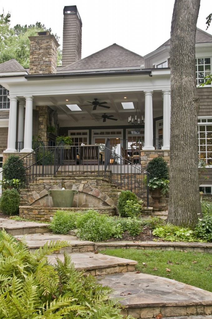
The project which won the award is a porch I designed. This back porch was built by Wright Marshall, and his team at Revival Construction.
Now that we are in the spring season, we can really appreciate a good porch. Porches are not the biggest projects I do, but they seem to have a giant impact on the lives of the people who build them, and the way they enjoy their houses.
I hope you enjoy this deeper look at the “Midtown Porch”.
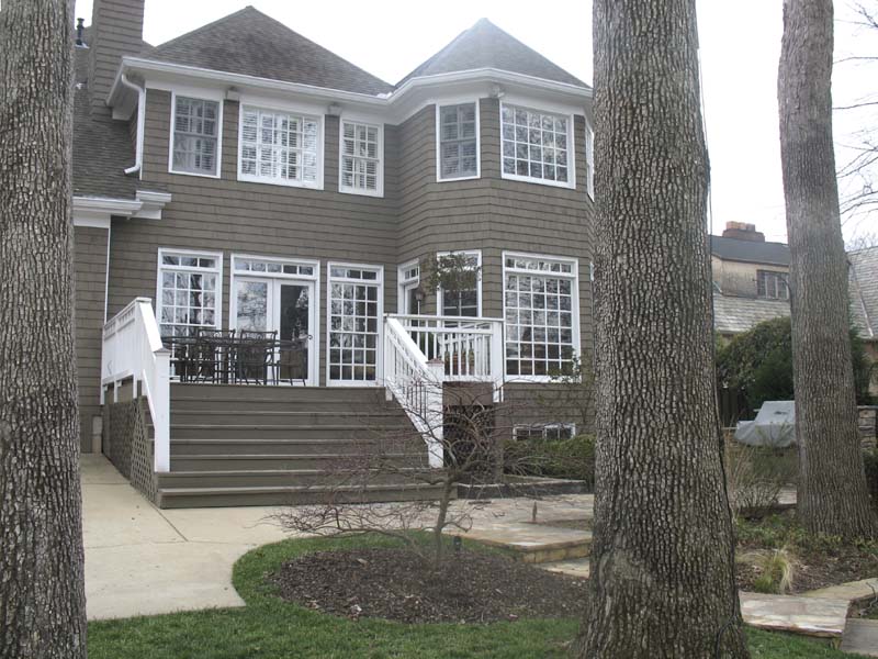
The house had a great back yard and pool, and a deck existed where the porch is now, but the owners were not able to fully enjoy their outdoor space. They wanted to create a porch that not only tied in with the house, and looked like it had always been there, but also extended their living space into the outdoors.
This is the house before the porch addition.
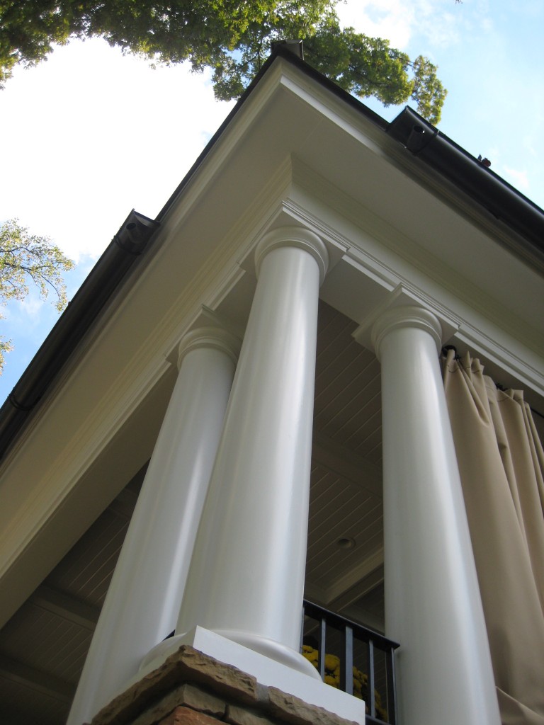
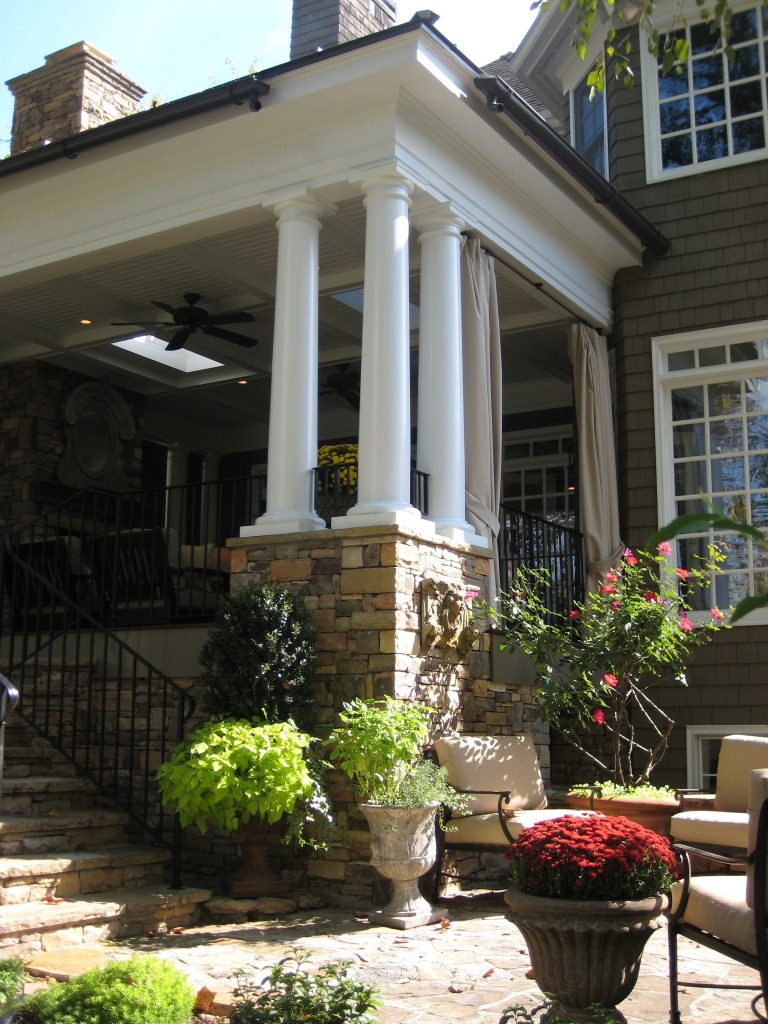
Classical detailing and proportions were used in the design of the porch, with the idea of giving it a timeless look.
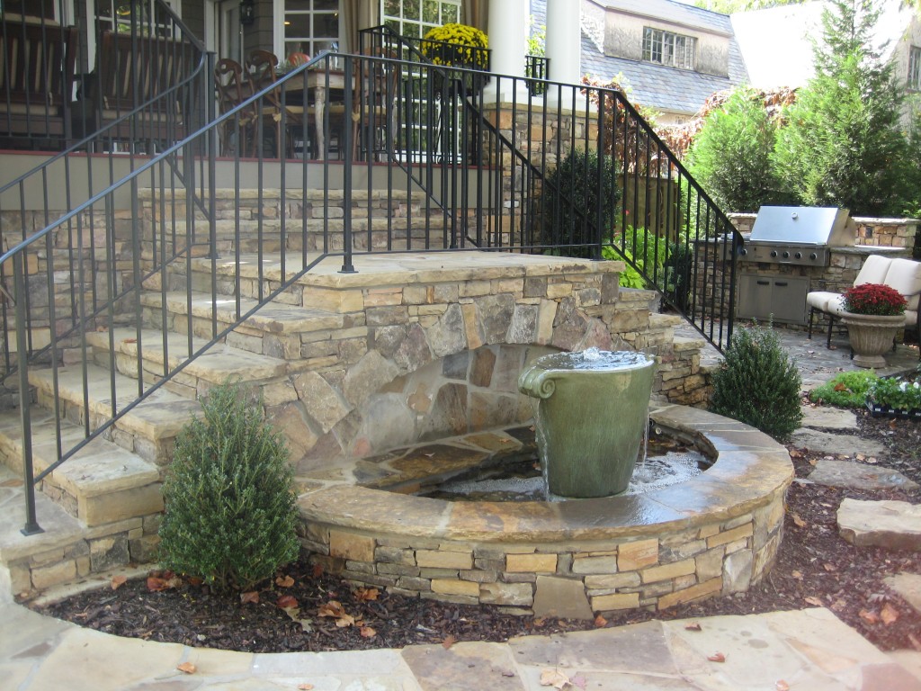
We included a small water feature as part of the design. The idea was to add the sound of water, to enhance the laid back, relaxed quality of the space. We also added a terrace and outdoor kitchen off the porch.
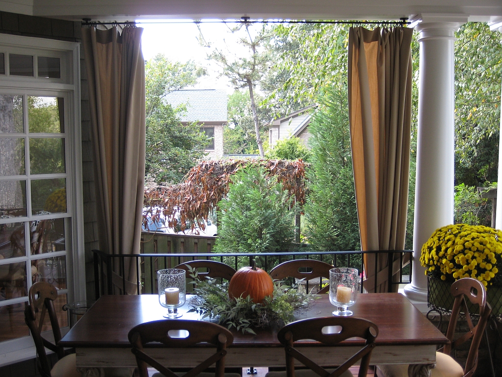
The porch is big enough to accommodate a dining area, which is adjacent to the breakfast room.
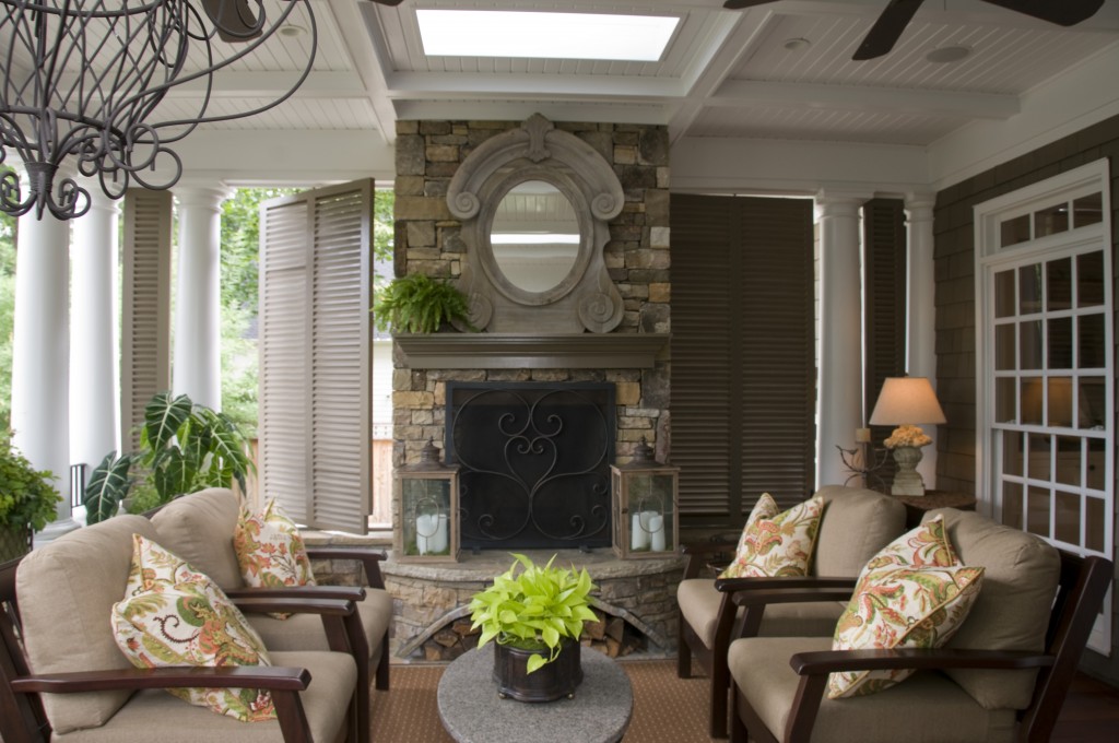
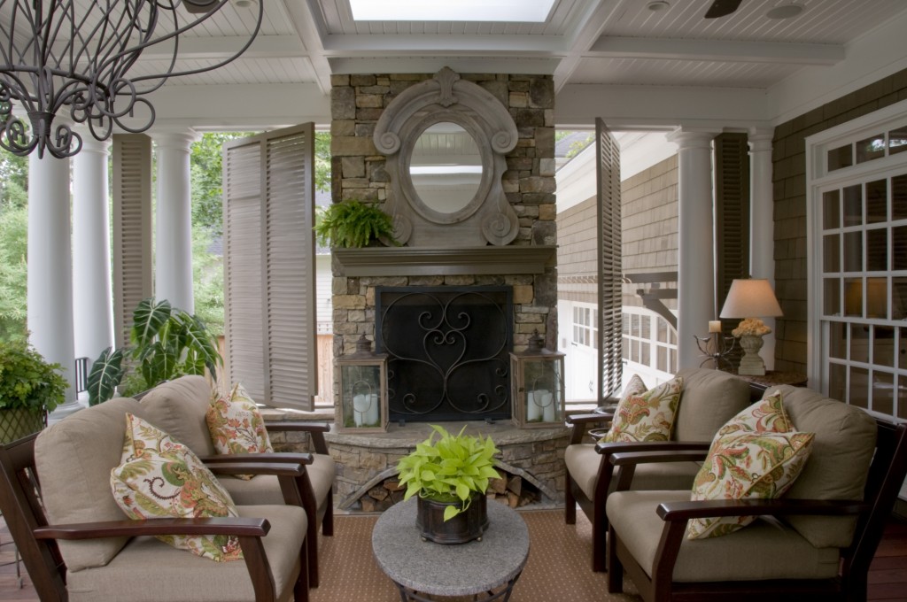
The “living room” portion of the porch is located off the family room, and acts as an extension of the room.
There are a few details in the space that are worth noting. The swiveling shutters always get a lot of attention. The side of the porch looks down on the garage and driveway. We wanted to block the view, but still be able to open the side of the porch to get the most breeze possible. The mantle is wooden, and more delicate than you would expect on a stone fireplace. We also incorporated skylights into the design. These were brought in to minimize the loss of light into the adjacent family room. They are copper skylights, reminiscent of what you would see in a museum, or old New York loft building. A very subtle, but note worthy detail is in the log storage area under the hearth. The masons were able to execute a compound curve in the design. The opening not only curves front to back, following the hearth, but also right to lest to create an arch. I assure you that putting this together was no easy task!
What I most enjoyed about this project is knowing that the clients’ lives have been truly impacted by it. Months later I ran into the client at a house tour, and she could not stop telling me how much they were using their new space, and how it had made them enjoy their house so much more.
Thanks for visiting!


Congratulations. But I’m getting dizzy thinking about compound curves. Where’d y’all get than mirror, I should say mirror frame.
Thanks Terry! I am not sure where the mirror came from, it was sourced by the client…
This is cool!
I love the mirror on the fireplace. Wondering where it might be purchased?
I am sorry, I don’t know where it was purchased. It was sourced by the owner.